BLEEDTHROUGH
/VISUALS + PACKAGING
00/IMITATION IS THE SINCEREST FORM OF PLAGIARISM
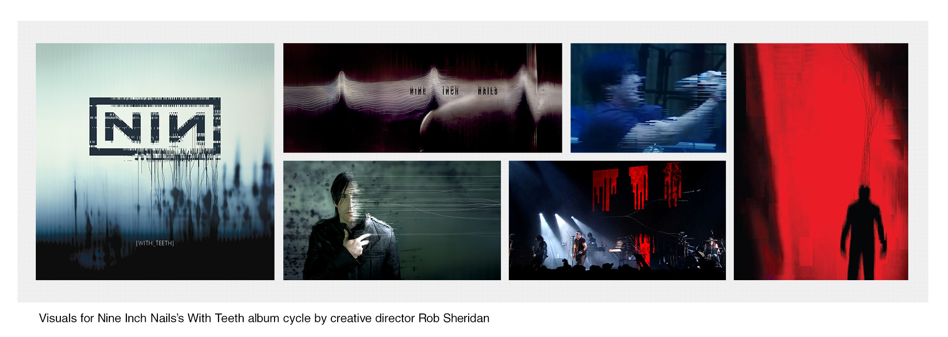
For With Teeth, NIN creative director Rob Sheridan began experimenting with glitch art, embracing errors in both digital and analog spaces. Glitch art is definitionally the product of error, and the processes involved are typically chaotic and random. While Sheridan’s work has been deeply influential, it would be a mistake to replicate rather than innovate. As much as Bleedthrough’s visuals had to feel appropriate to the artists’ canon, it needed to find its own process.
01/HALO 19_BLEEDTHROUGH
The word “negotiation” comes up a lot when I think about this. Every choice was in dialogue with the original album’s art, figuring out where to adhere and where to deviate. The first and most obvious choice: red.
The background was beaten up and reprocessed a hundred times over across a half dozen tools, all its detail reduced to a choreographed gradient. The backwards N sitting atop it was a conscious choice: most NIN campaigns have been branded with different distortions or croppings of the Gary Taplas-designed NIN logo. This felt like the place for a statement.
The interior portrait of Reznor gestures at one from With Teeth, seen above in Sheridan’s work. Replicating his meticulous pixel-stretching was at odds with my own inherent laziness, so I leaned heavily on Sean Ellis’s spectacular photos for SPIN. That blue-tinged portrait was treated red and flattened into another background achieved by threshing data across apps. Obscuring Reznor’s eyes with a beam of CRT noise picks up on his mention of “layers of reality”, offering a character whose perspective is strained and obstructed.
02/HALO 18_SUNSPOTS
There’s a saying, “history doesn’t repeat, but it does rhyme.” Sunspots is meant to echo Sheridan’s The Hand That Feeds single in the same way, embracing forcibly pixelated lines, but eschewing blackness for a bursting source of light and color. The characteristic “bleedthrough” dots from With Teeth weave throughout the piece as both texture and highlight. The result is a piece that’s true to the energy of the song; vital, untethered, and triumphant.
03/HALO 20_LOVE IS NOT ENOUGH
Advancing an image from the Bleedthrough album art, the outstretched hand plays on the theme of “layers of reality” Reznor discussed for Bleedthrough, reaching from one layer into another. Sourced from an in-progress video for the song, the visuals are meant to gesture at something surreal and vaguely apocalyptic.
04/HALO 21_DEEP
Daring to acknowledge the existence of the Deep video, the single art feeds its cars and color schemes into a glitch blender. The orange and green dyes from the clip infect the visuals, respectively defining dusk and artificial light. Deep’s interior art goes even further, repurposing a still from the video for a piece that looks made by a digital palette knife.
05/POSTERS
Bleedthrough features a full print campaign, including outdoor superboards and unique posters for each city on the tour. Well, three of them. I am planning my exit right in front of you.
// return to bleedthrough menu